![]() This year marks the 30th anniversary of our first market opening in Carrboro, and it’s hard not to look back fondly on those early days when we were just getting started. A single store, run by just a handful of us, supported by a small group of community owners who believed in what we were trying to do.
This year marks the 30th anniversary of our first market opening in Carrboro, and it’s hard not to look back fondly on those early days when we were just getting started. A single store, run by just a handful of us, supported by a small group of community owners who believed in what we were trying to do.
Today, as we prepare to open our fourth store in the heart of downtown Raleigh this fall, we enjoy the support of more than 22,000 consumer owners, 250 worker owners, and countless community members who come to Weaver Street to shop, gather, share, laugh, and—of course—eat healthy, delicious food.
As we began to look ahead to the next 30 years, we embarked on an effort to refresh the Weaver Street Market look. Along with a fresh new look, we’ve also updated our story to reflect who we are as an organization: where we’ve been, where we are today, and where we’re headed.
A compelling story
Our first goal was to refresh our story with new messages that reflect all the ways we’ve grown while preserving what’s always been true about Weaver Street.
Our new message captures everything we want the world to know about Weaver Street:
We sustain healthy communities together.
And how do we do it?
Through the goods we sell, and the good we do.
These two statements are supported by four foundational story pillars that span everything we want the community to know about us:
- Trusted Quality – Selling quality goods that are fresh, healthy, and sustainable
- Locally Sourced – Partnering with community-minded producers
- For the Community – Creating a healthier community while ensuring we all have good food to eat
- By the Community – Sharing the journey of creating a thriving marketplace
A fresh look
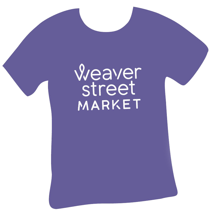
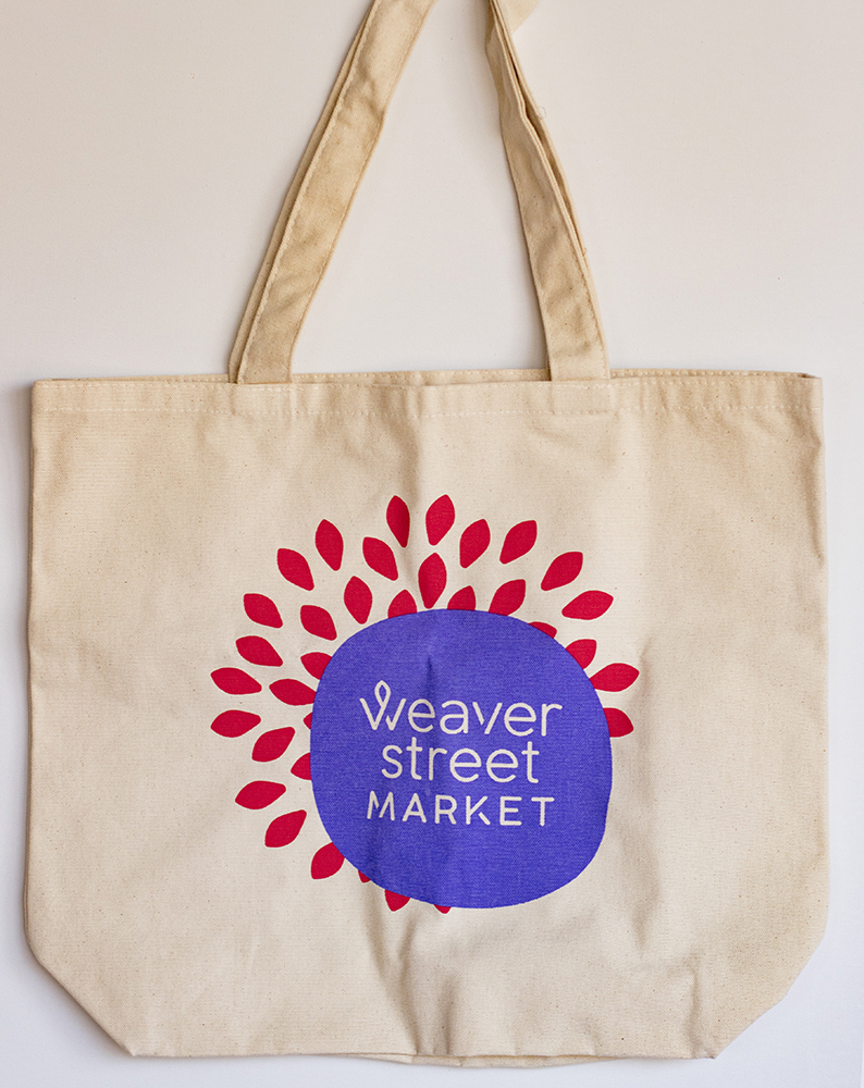
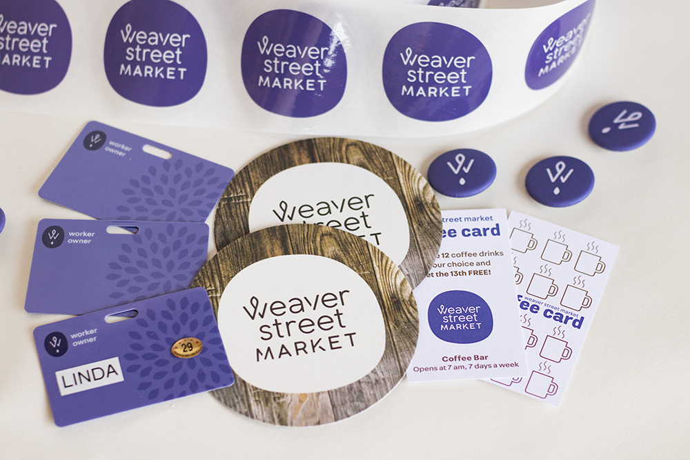 Our newly articulated story laid the foundation for Weaver Street’s new look. And it’s not just a new logo, but a complete visual system—a new color palette, icons, and pattern styles; packaging; in-store signage; and more—that works together to bring our story to life.
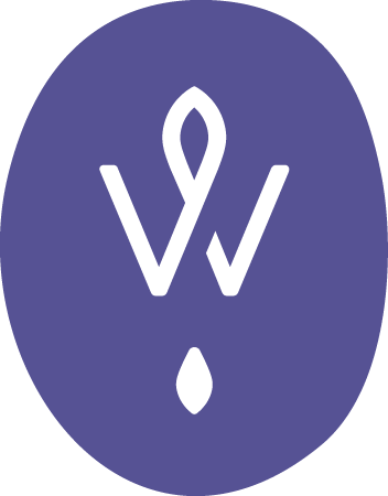
 The logo’s shape is imperfect by design, meant to convey a distinctly human, hand-touched quality reminiscent of a fingerprint. The overlapping center of the “W” symbolizes how we bring people together, sharing and uniting to make Weaver Street vibrant and sustainable.
Nestled underneath the shorthand “W” logo is the shape of a seed, representing growth and nourishment. This is also the foundational element for many of the new, vibrant backgrounds you’ll soon see throughout our stores.
We’ll roll out the new look both online and in stores over the next few months.